
Werner Rudolf Cramer
Hafenweg 22, 48155 Münster
Germany
This was written with the great help of jQT (formerly jQTouch)!
Last update: 12/16/2019
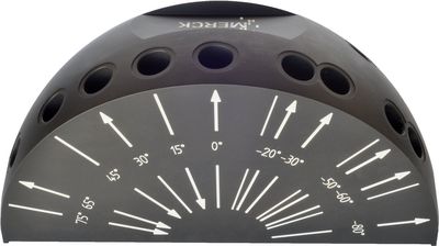
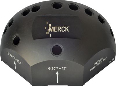
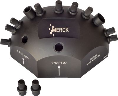
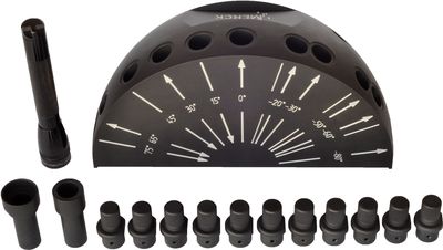
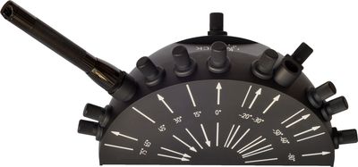
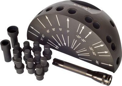
New Gonio-Vision-Box
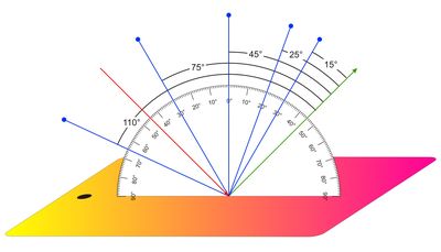
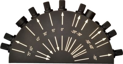
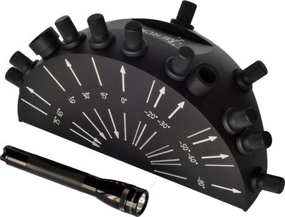
The new version of the portable Gonio-Vision-Box, which serves to validate the visual assessment of samples, features fewer geometries than the first version: The off-plane geometries of the X-Rite MA98 as well as the third illumination on the Datacolor MultiFX10 are a thing of the past. If requested, of course, the initial version of the Gonio-Vision-Box can still be built and sold. Since all users work with the classic geometries at an illumination of 45°, the new version GVB.2 includes the aspecular geometries -15°, 15°, 25°, 45°, 75° and 110°.
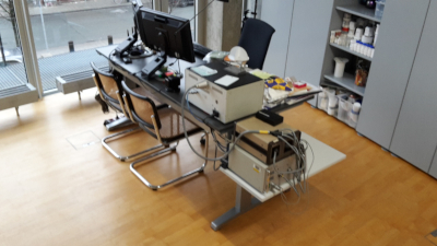
The basic body of the Gonio-Vision-Box is milled out of aluminum and features a total of seven holes. They accommodate either the lamp holder for an LED flashlight, an "eye" for observation or plugs for blocking extraneous light. The corresponding geometries are milled into the side plate, enabling simple orientation. For evaluation, two plates can be pushed under the Gonio-Vision-Box.
For many users, the angle specifications on the measuring instruments are often hard to comprehend. Starting with an illumination angle of 45°, the portable devices measure at 15°, 25°, 45°, 75° and 110° from gloss. This lies -45° from the normal. The negative sign is physically not entirely accurate, since the optical law
holds true.
The aspecular geometries are calculated from gloss. As such, the specified angle of 15° actually means that the measurement takes place 15° from gloss and thus is conducted at -30°.

A new addition is the -15° geometry, which is measured behind gloss, in the "trans" position. Together with the +15° geometry, thus the "cis" position, the reflection curves can be used to analyze whether this is a coating formulation with color interference pigments or with white interference- or aluminum pigments.
![]()
Interference pigments - and with them, pigmented paints or plastics as well - can only be measured at an angle close to gloss. A reversal from the reflection color to the transmittance color takes place in the area between 20° - 30° from gloss. In simple terms, this means that the interference color most heavily influences the total color impression near gloss, while the absorbing portions determine the total color impression further from gloss.
This example shows pearl green on a gray background. The form of the reflection curve switches between 25° and 45°: That is the switch from the reflection to the transmittance.
![]()
The law of interference shows the dependency on the angle of the illumination: The flatter an illumination is, the more the color shifts towards the short wavelength. In this chart, the interference line connects the measuring points at different illumination angles. The gray line shows the values that are measured with the portable instruments.

ASTM E2539
In April 2000, experts from various specialties met up in Santa Rosa to launch the E 12.12 work group named, "Measurement of Metallic and Pearlescent Colors" in the ASTM Group E.12 "Color and Appearance". The circle of experts, which later grew to include others, included:
Richard Harold, Paul Hoffmann, Jim Leland, Cal McCamy, Maria Nadal, Allan Rodrigues, Will Weber, Werner Rudolf Cramer, Ujjvala Bagal, Mike Nofi, Ken Richardson, Pat Rood and Paul Bartel.
The question of "How long will it take?" - meaning the time it would take to establish the measuring geometries - was put to the group; their response was 1-2 years, but no more than 1 year, 3 years or 5 years.
In fact, it took 8 years before E2539 "Standard Practice for Multi-angle Color Measurement of Interference Pigments" was finally completed in 2008.
The geometries for measuring interference pigments were put together on the basis of many presentations and discussions. Right from the start, it was clear that the classical geometries for measuring metallics would be involved.
Originally, three illumination geometries were to be defined - one steep, one classic and one flat. Of these three, only two geometries remain. The third geometry - the flat - was removed again since it cannot be practicably implemented in portable equipment.
This ASTM standard not only includes the new definition of a second illumination, but also measurement behind the radiance, i.e. in "trans" position. The ASTM table combines the "cis" with the "trans" geometries. "Cis" geometries are those in which the angles of illumination and observation are on the same side relative to the glancing angle. If the angle of observation is on the opposite side to the illumination, this is referred to as a "trans" angle.
The ASTM standard contains two tables:
"Specified Geometries for Measuring the Color Range due to Interference" contains two angles of illumination and cis/trans observation, each of ±15°.
"Specified Geometries for Measuring the Color due to Scattering or Orientation" corresponds to the classic measuring geometries at a 45° angle of illumination and different angles of observation of 15°, 25°, 45°, 75° and 110°.
E2539:
"Specified Geometries for Measuring the Color Range due to Interference"


E2539:
"Specified Geometries for Measuring the Color due to Scattering or Orientation"

 I expanded my photo laboratory in the mid 1970s, when I developed successful recipes and processes to produce prints up to 40 x 50 cm in size directly from slides without inter-negatives. My specialties included film developments - color negative film and slides - as well as pseudo-solarizations in color.
I displayed color prints that I made out of pseudo-solarized film in 1976 at my first exhibition at the town hall in the city of Münster, Germany. This was followed by twelve more exhibitions (also in towns such as Orleans, France and Enschede, Netherland) with various motif groups.
My preoccupation with color photography (and with the laws of color) was a good basis for starting up with automobile paint design. Since the refinishing paint can no longer be recognized once damage to an automobile has been repaired (that's the prerequisite for a successful repair), I had the idea of making targeted use of refinishing paint to style vehicles.
I gave this styling and technique the name "Autolackdesign" (automobile painting design) and, at the end of the 1980s, I wrote a book about it under the same title.
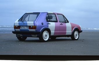
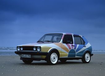
 Complete styling of my first Golf: I primed the car with a white primer, placed a white pearlescent paint on top of it and then added two layers of clear coat. I taped up the stripes on the transparent varnish, painted the surfaces with a shaded primer and then with the colored pearlescent paint. I then added up to eight coats of clear coat with some intermediate sanding to give the effect that all the color stripes appear to be embedded in glass. This work took almost three months to complete.
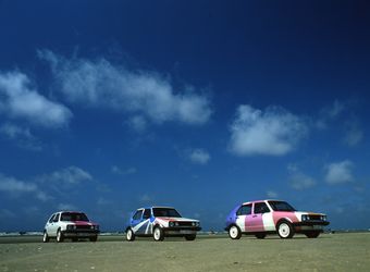
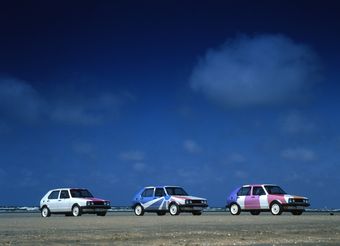
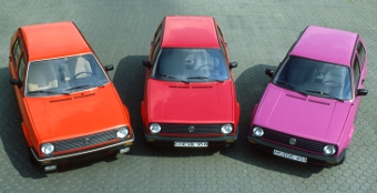
 This "Sun King" was the first of three models: The first Sun King (to the right in the photo) had color stripes that started on the rear right corner of the roof and ran towards the front left side. The second "Sun King" (shown in the middle of the photo) had the "sun" on the right side of the car, such that the driver's side of this Sun King was white.
The third "Sun King" was the brightest. It had the sun at the bottom of the driver's side and the color stripes proceeded across the entire vehicle (to the left in the photo).


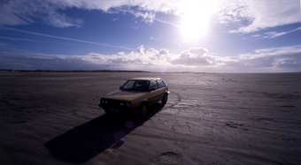
At the end of the 1980s, I came up with the idea of using new combination pigments (interference pigments featuring mica carriers and titanium dioxide/iron oxide layering) to create a golden paint. I selected one of 12 trial batches and baptized it with the lovely Latin name "aurum magicum". Its color and brilliance put it ahead of all of the other gold paints.
When compared to a vehicle painted with real gold powder, all of the testers were of the opinion that it was my Golf that had the genuine gold. I had not only "invented" gold, but had also succeeded in creating pale gold and rose gold all in one.
Eventually I sold the license to manufacture "aurum magicum" to the Wuppertal coating manufacturer Herberts, which offered the paint color in the refinishing program featured by Standox.
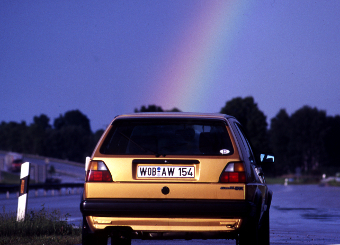 Where the rainbow ends is where the "aurum magicum" begins!

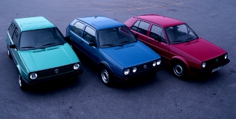 People should talk about paints and be able to recognize them! With this in mind, I created three OEM series paints for Volkswagen at the end the 1980s: "Golf Green" was and is the most noticeable series paint color, since its maximum reflection lies at the same wavelength as the maximum reflection of the sensitivity of our human eyes. "Golf Red" is the reddest shade of red in the series. "Golf Blue" completes the threesome.
 "Mars Red" is on the left-hand side of the picture and is more yellow than "Golf Red", while "Verkehrs Purple" to the right is more blue than "Golf Red", which is the reddest red!
And where is the yellow in this trio? Stylistically speaking, a strong yellow would not fit well with these three Golf colors. And there's no dark yellow to be seen. Brown and ocher are not dark yellow colors, but they are often suggested as alternatives. As such, we stuck with the creation of these three "Golf colors"!
Sophisticated Colour Matching Made Easy
European Coatings Journal 12/2019Der Farbe auf der Spur
Farbe und Lack 12/2019Effektpigmente in Autolacken
Magazin für Oberflächentechnik 9/2019干涉顏料的表征
Characterisation of Interference Pigments
China Coatings Journal 9/2019Useful and useless geometries
PPCJ 08/2019Farbe als Übersetzung der physikalischen Welt
JOT 08/2019啞光效應的實驗
Experiments with Matt Effects
China Coatings Journal March 2019Nicht die Menge macht's
Farbe und Lack 02/2019Die Fibonacci-Versuchung
DfwG-Report 1/2019Measuring effects
European Coatings Journal 01/2019Matteffekte messen
Farbe und Lack 01/2019
色彩和效果表述方法
PCI 中文版 2018年9月Über Geometrien
DfwG-Report 2/2018Methods for describing Color and Effects
Paint & Coatings Industry 08/2018全方位探討塗料色彩
Colours seen from all sides
China Coatings Journal 6/2018Shades of Differences
European Coatings Journal 04/2018Eine Sache des Blickwinkels
Farbe und Lack 04/2018Der Wiederverkaufswert bestimmt
Farbe und Lack 02/2018
Mehr als Effekthascherei
Farbe und Lack 12/2017Eines für alle - Mischsysteme im Einsatz
DfwG-Report 2/2017Kein blasser Schimmer
Kunststoffe 07/2017Autolack: Wie Deutschland die Farbe verlor
www.farbeundlack.de 05/2017以干涉顏料對彩色與灰色底漆進行測試對比的研究(下)
Coloured versus Grey Undercoats - Trials with Interference Colours (Part 2)
China Coatings Journal 5/2017以干涉顏料對彩色與灰色底漆進行測試對比的研究
Coloured versus Grey Undercoats - Trials with Interference Colours (Part 1)
China Coatings Journal 3/2017Undercover influences
European Coatings Journal 05/2017Buntes in Vergangenheit und Moderne
Fahrzeug + Karosserie 05/2017Die Mischung macht's
Fahrzeug + Karosserie 05/2017Lackierfehler - und wie sie sich vermeiden lassen
Fahrzeug + Karosserie 05/2017Welcher Füller darf's denn sein?
Fahrzeug + Karosserie 05/2017Livestream 2017/03/08
Farbe und Lack, Vincentz-VerlagIm Untergrund steckt der Einfluss
Farbe und Lack 03/2017Hidden Secrets of Effect Pigments
Paint & Coatings Industry 01/2017
Farben und Mischlacke
Fahrzeug + Karosserie 12/2016Farbe, nichts als Farbe?
DfwG-Report 3/2016干涉着色剂和多色着色剂的有效使用
Paint & Coatings Industry 中文版 2016年11月The Effective Use of Interference and Polychromatic Colorants
Paint & Coatings Industry 09/2016Matt soll matt bleiben
autofachmann 08/2016Great-looking thanks to interference pigments
European Coatings Journal 06/2016干涉颜料与多彩色颜料的有效利用
www.chinacoatings.com.cn 06/2016Matt soll matt bleiben
kfz-betrieb 16/2016Veränderungen in kleinen Schritten
Fahrzeug + Karosserie 04/2016Rainbows made to order
European Coatings Journal 04/2016夢幻色彩創造的八個黃金法則
Eight Golden Rules for a Fantastic Colour Creation
China Coatings Journal 03/2016Jenseits des Regenbogens
Farbe und Lack 03/2016Formulating Excellent Automotive Effects
European Coatings Journal 01/2016Das 1x1 der Farbkreation
Farbe und Lack 01/2016
Farben und Mischlacke
Fahrzeug + Karosserie 12/2015Effektheischend und bunt
Farbe und Lack 11/2015Wenig Neues in Sicht
Fahrzeug + Karosserie 10/2015Die Mattigkeit und ihre Folgen
Fahrzeug + Karosserie 04/2015Mal so und mal so
Fahrzeug + Karosserie 02/2015Aus meiner Sicht
Fahrzeug + Karosserie 01/2015Weniger Bunt, mehr Weiß auf deutschen Straßen
Farbe und Lack 01/2015
Wenn Farben fehlen
Fahrzeug + Karosserie 12/2014Was hinterm Farbwunsch steckt
Fahrzeug + Karosserie 11/2014Immer noch keine Bewegung
Fahrzeug + Karosserie 08/2014Reparaturlackierung Teil4
Fahrzeug + Karosserie 08/2014Wem gehört das Rot nun wirklich?
Fahrzeug + Karosserie 07/2014Effektpower auf neuer Basis
Fahrzeug + Karosserie 06/2014Farbenwelt und Mischsysteme
Fahrzeug + Karosserie 05/2014So sieht's aus auf den Straßen
fml 05/2014Alles wie bisher oder?
Fahrzeug + Karosserie 03/2014Reparaturlackierung Teil3
Fahrzeug + Karosserie 02/2014
Farben und Mischlacke
Fahrzeug + Karosserie 12/2013Reparaturlackierung Teil1
Fahrzeug + Karosserie 10/2013Nichts Neues von der Straße
Fahrzeug + Karosserie 9/2013Mattlackierungen beurteilen
Fahrzeug + Karosserie 5/2013Dabei zwei neue Farben kreiiert
Fahrzeug + Karosserie 4/2013Nicht mehr Farbe im Jahr 2012
Fahrzeug + Karosserie 2/2013Reparaturlackierung Teil4
Fahrzeug + Karosserie 2/2013Mix and match
European Coatings Journal 1/2013Strategisches Farbdesign
Farbe und Lack 1/2013Und somit deutlich schneller
Fahrzeug + Karosserie 1/2013
Farben und Mischlacke
Fahrzeug + Karosserie 12/2013Reparaturlackierung Teil1
Fahrzeug + Karosserie 10/2013Nichts Neues von der Straße
Fahrzeug + Karosserie 9/2013Mattlackierungen beurteilen
Fahrzeug + Karosserie 5/2013Dabei zwei neue Farben kreiiert
Fahrzeug + Karosserie 4/2013Nicht mehr Farbe im Jahr 2012
Fahrzeug + Karosserie 2/2013Reparaturlackierung Teil4
Fahrzeug + Karosserie 2/2013Mix and match
European Coatings Journal 1/2013Strategisches Farbdesign
Farbe und Lack 1/2013Und somit deutlich schneller
Fahrzeug + Karosserie 1/2013Visuelle und instrumentelle Geometrien der Farbabmusterung
DfwG-Report 3/2012- Warum Farben so schön sind!
Fahrzeug + Karosserie 11/2012 - Reparaturlackierung Teil3
Fahrzeug + Karosserie 09/2012 - Den eigenen Farbton schaffen
Fahrzeug + Karosserie 09/2012 - Reparaturhersteller mittendrin
Fahrzeug + Karosserie 09/2012 - Den Geheimnissen der Lackkunst auf der Spur
Phänomen Farbe 08/2012 - 顏色匹配中的目測及儀器幾何條件—
為何使用者覺得顏色匹配困難?
Visual & Instrumental Geometries in Colour MatchingChina Coatings Journal 7/2012 - Alu-Pigmente sorgen für Reflexe
Fahrzeug + Karosserie 08/2012 - Farben und Mischlacke
Fahrzeug + Karosserie 07/2012 - Wie sag ich's meinem Kunden?
Fahrzeug + Karosserie 07/2012 - Neue Version der Gonio-Vision-Box
Phänomen Farbe 07/2012 - Effekte richtig verstehen
Fahrzeug + Karosserie 05/2012 - Making Sense of Measurement Geometries for Multi-angle Spectrophotometers
Color Research and Application 04/2012 - Weniger Silber, mehr Weiss in 2011
Phänomen Farbe 04/2012 - Color Diversity
Kunststoffe International 04/2012 - Über die Vielfalt der Farben
Kunststoffe 04/2012 - Es glitzert wie am Sternenhimmel
Fahrzeug + Karosserie 04/2012 - Reflections on the right angle
European Coatings Journal 04/2012 - Beurteilung und Abmusterung von Interferenzpigmenten
Farbe und Lack 1/2012 - 干涉顏料的光學性能——其描述和表征的方法
Optical Properties of Interference Pigments - Solutions to the Problem of their Description & CharacterisationChina Coatings Journal 3/2012 - Farbiger oder grauer FüllerFahrzeug + Karosserie 3/2012
- Optische Wirkung des KlarlackesFahrzeug + Karosserie 1/2012 3/2012
- Es graut so grau auf deutschen StraßenFarbe und Lack 3/2012
- Es wird eintöniger auf der StraßeFahrzeug + Karosserie 2/2012
- Historical stories with Carl BenzCarl Benz 7
- Eine Fahrt ins Blaue
Fahrzeug + Karosserie 01/1996 - Fahrzeugbauer der ersten Stunde
Fahrzeug + Karosserie 02/1996 - Die treibende Kraft
Fahrzeug + Karosserie 03/1996 - Der neue Betriebsleiter
Fahrzeug + Karosserie 04/1996 - August Horch in Paris
Fahrzeug + Karosserie 06/1996 - Es war zu Beginn dieses Jahrhunderts
Fahrzeug + Karosserie 07/1996 - Benz Rausschmiß und Neubeginn
Fahrzeug + Karosserie 09/1996
You waiting for a new book? Don't mind but I need some time! I just started!
In this book, I outline and present a number of my works dealing with "automobile paint design". It contains notes and information about colors, color systems, paints, paint applications and airbrushing.
My first Windows book - 3 years after the purchase of my first Compaq PC.
My second Windows book - now about Windows 3.1
Airbrush book No.1
Airbrush book No.3 - the completely revised edition of Airbrushing book No. 1
Airbrush book No.2
Karosserie- und Fahrzeugbau: This history book was written together with Ingo Röver, who was responsible for the corrections and the technical details.
Co-author of 21st edition of Brockhaus encyclopedia
Co-author of "Auto und Karosserie"


- Orientation: portrait
- Page events
- Swipe me!
- Tap me!